Given the big moves down in global sharemarkets and corresponding moves up in gold in recent days we thought it timely to take a look at a number of gold and silver charts. To see where we are, where we’ve been, and maybe even to have a stab at where we might be going! (Stab being the operative word of course!)
(Note: For a 2018 update of these charts see: Gold Ratios Update: Dow/Gold, NZ Housing to Gold, & Gold/Silver Ratio).
Shares Versus Gold
First up gold is (finally) doing as it should and rising when panic is hitting everywhere else, as can be seen in the chart below via Casey Research. The price of gold in US Dollars rose 3.8% last week, while US stocks lost 5.8%.

Dow/Gold Ratio
This relationship between gold and shares is best tracked by the Dow/Gold ratio. This takes the value of the US Dow Jones Industrial Average and divides it by the price of one ounce of gold in US Dollars. Or put another way – how many ounces of gold it takes to “buy the Dow”. Basically a measure of how cheap shares are versus gold.
You can see by the chart below that shares have been rising versus gold since 2011. The sell off over the past few days is taking the ratio back down close to the rising trend line. Our guess is that we are not too far from it resuming the downward trend it was in from 2000 – 2011. But odds are first we are due a bounce in stocks after such a sharp fall.
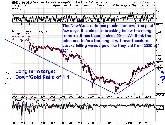
Our long term target for the Dow/Gold ratio remains around 1:1. For example the Dow might fall to 8000 and gold would rise to US$8000 per ounce.
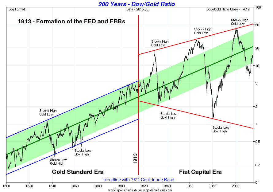
See the very long term Dow/Gold Ratio chart below from Sharelynx.com for why 1:1 looks like a good bet. The rise of the last few years looks remarkably similar to the mid 70’s rise, before gold resumed its upward march.
Gold/Silver Ratio
The Gold/Silver ratio is simply the amount of ounces of silver it takes to buy one ounce of gold. Or take the gold price and divide it by the silver price.
You’ve likely heard that the ratio in the ground of gold to silver is around 15:1 or 17:1 depending on which geologist you want to believe. Historically we have seen the ratio vary widely just as you can see in the chart below since the turn of the century.
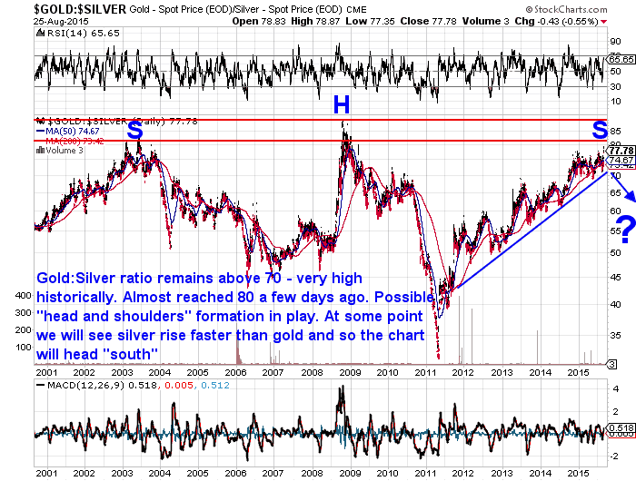
Currently the ratio is the highest it has been since 2008. Meaning silver is very cheap compared to gold. Back then silver plummeted as did just about everything else. Gold held up better hence the ratio blew out rapidly in the space of only a few months.
We now have a quite symmetrical looking chart. With a steady rise up to 2003, a steady fall until 2008, before a sharp rise and then a sharp fall into the 2011 lows just above 30. Then a steady rise again with the peak being almost in line with that of 2003.
So we have what is known as a “head and shoulders” formation. Nothing to do with anti-dandruff shampoo! Just a reflection of the “head” (H on the chart) that is slightly higher than the 2 “shoulders”.
Our guess is we are not too far away from silver again rising faster than gold (i.e. the chart will start falling again).
Our long term target for the gold:silver ratio is likely somewhere around 10. That is, it will overshoot the previous lows which you can see in the long term Gold/Silver ratio chart below. At todays gold price of US$1140, that would put silver at US$114 per ounce. So potentially silver has a lot of upside ahead. It’s just tough to know exactly when this “upside” will begin to kick off.

Housing to Gold Ratio
The Housing to gold ratio is a measure of how many ounces of gold it takes to buy the median house price in New Zealand. We need to update our charts for this one, but for now we’ll just take a snap shot of where we are at today and compare this to the past in the old chart below. (For more on the NZ housing to gold ratio see this old article.)
As of the latest data at the end of July the median NZ house price was $465,000. Gold in NZ dollars at this date was $1656.
So the NZ housing to gold ratio at the end of July was $265,000 / $1656 = 280 ounces. It has risen steadily from the 200 ounces it reached in 2010. But again if history repeats we might see this ratio head back down well below 100 ounces like it did in 1980.
Your gold would buy an awful lot more house if that were to occur. We think this current rise in the ratio is much like the Dow’Gold ratio we discussed earlier. Just a short term uptrend in a longer term downtrend in the ratio. i.e. Housing is rising in gold terms for now but in the long run it won’t.

Gold in New Zealand Dollars Chart
With gold rising in US dollar terms with the sharemarket sell off and the NZ dollar also taking a tumble below 65 cents, gold in NZ dollars has broken out to almost 2 year highs this week. It has been trending steadily higher for over a year but appears to have broken into a higher range now.
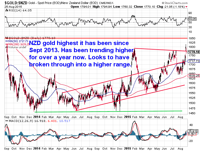
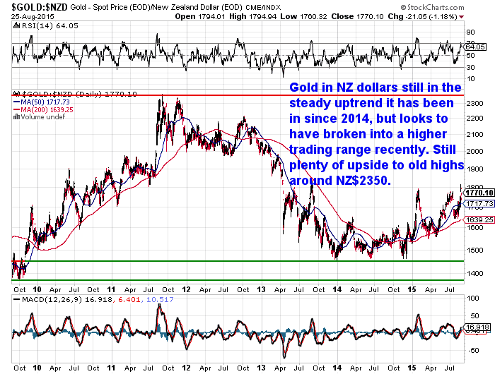
Still a lot of upside ahead to reach old highs around NZ$2350 as can be seen in the below longer term chart.
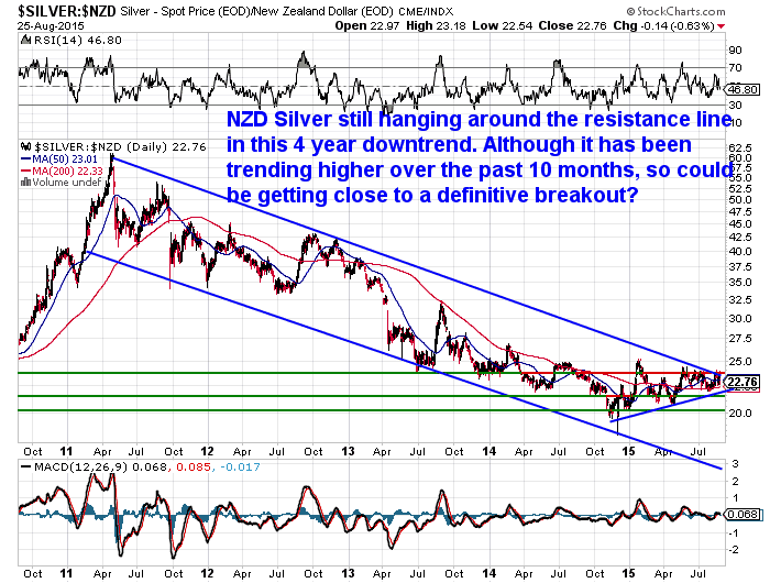
Silver in New Zealand Dollars Chart
NZD silver has been trending higher over the past 10 months. It looks to be getting close to a break out from the 4 year downtrend it has been in.
HUI Gold Bugs Index vs Gold Chart
The chart below plots the HUI Gold Bugs Index (a group of gold mining shares) versus gold itself. You can see in the chart below that the miners have not been this cheap against gold during the whole of the current precious metals bull market.
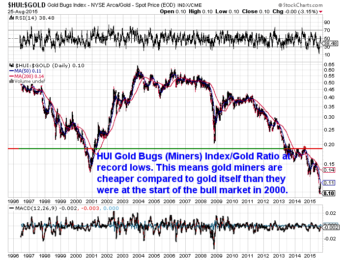
So is it a good time to be buying shares in gold miners? The folks at Casey Research think there is likely some very big upside ahead in the correctly chosen mining companies…
Final Opportunity to Subscribe — Buy Gold Like an “Insider”
September 3 is your absolute last chance to become an International Speculator reader and set yourself up for explosive, triple digit gains in the gold market in the years to come. I’m talking about exceptional gains like: Virginia Gold up 2,054%… Fronteer Gold up 2,223%… Detour Gold up 1,319% and ATAC Resources up an incredible 11,212%. These are all stock-market winners from the early 2000s, but one of the most admired gold experts in the world believes the opportunity is about to happen again soon. Click here to learn more.
So Where to From Here?
After sharemarkets have fallen so far so fast, we can likely expect a decent bounce higher from here in the short term.
2007 – 2008 saw a break down in global stock markets, which played out fairly slowly at first before a final bloodbath. So if history rhymes, we could well see a bit of choppy action in global sharemarkets before further plunges lower.
However a difference from the 2008 crisis is that gold and silver are currently near their lows and so any further downside to them is likely quite limited. Whereas back in 2008 they were reaching what were then record highs before they too were caught up in the downdraft of selling that occurred in just about everything.
Speaking of history rhyming, this period also makes us wonder if we are seeing some similarity to the 1930’s. Back then the USA was the ascending power, but that didn’t stop them suffering the full fury of the Great Depression.
We wonder if China may be in the early stages of something similar? Most people (NZ bank economists included) think China will just continue to steadily grow and that their leadership has them on a steady course, maybe with just the odd hiccup along the way. But nothing like a major hard landing is expected in the mainstream.
But what if they are instead heading into just that? A very hard landing. This will have a very negative effect for the global economy. And with central banks across the planet with either zero or very low interest rates they don’t have much ammunition left should we experience another downturn.
We think times are about to get very interesting and most people remain blissfully unaware.
Pingback: Good Time to Sell NZ Shares and Buy Gold or Silver? - Gold Survival Guide
Pingback: Silver Fireworks! - Gold Survival Guide - Gold Survival Guide
Pingback: Gold and Silver ChartFest - Update for 2016 - Gold Survival Guide - Gold Survival Guide