See a comparison between August 2015 and July 2016 of:
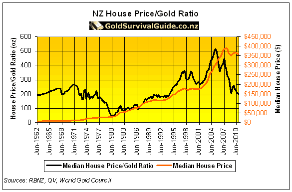
(Note: For a 2018 update of these charts see: Gold Ratios Update: Dow/Gold, NZ Housing to Gold, & Gold/Silver Ratio). Earlier today we posted a summary of a video that looked at the large moves in silver over the past week. And in particular the move in the gold to silver ratio. It referenced an article we wrote last year that looked at the set ups in various charts that pointed to a possible resurgence of the precious metals bull market. We thought it was worth a look back to see how things had progressed in the 10 months or so since it was written. So today we’ll post the charts from last August and the corresponding chart from today. This relationship between gold and shares is best tracked by the Dow/Gold ratio. This takes the value of the US Dow Jones Industrial Average and divides it by the price of one ounce of gold in US Dollars. Or put another way – how many ounces of gold it takes to “buy the Dow”. Basically a measure of how cheap shares are versus gold. It took until earlier this year but the Dow:Gold ratio did indeed break below the uptrend line and head down as low as 12.5. It currently sits just over 13. So perhaps we have indeed seen a change in trend to gold outperforming the US stockmarket? But remember, this doesn’t necessarily mean the sharemarket has to fall. Merely that shares just don’t rise as much as gold. Our long term target for the Dow/Gold ratio remains around 1:1. For example the Dow might fall to 8000 and gold would rise to US$8000 per ounce. See the very long term Dow/Gold Ratio chart below from Sharelynx.com for why 1:1 (or even lower) looks like a good bet. The rise of the last few years looks remarkably similar to the mid 70’s rise, before gold resumed its upward march. The Gold/Silver ratio is simply the number of ounces of silver it takes to buy one ounce of gold. Or take the gold price and divide it by the silver price. You’ve likely heard that the ratio in the ground of gold to silver is around 15:1 or 17:1 depending on which geologist you want to believe. Historically we have seen the ratio vary widely as you can see in the charts below from the turn of the century. Last August we postulated that silver was getting very undervalued compared to gold and due to return to lower levels before long. As it happened we were a bit early on this call as the ratio actually went even higher. Getting up to 85 earlier this year. However since then the ratio has moved sharply lower. Clearly breaking through the blue uptrend line back in April. With the large moves in silver over the past week it has now gotten down below 68. So it does appear that silver has switched back to outpacing gold as it usually does during a precious metas bull market. Of course don’t expect this to be a straight line lower like the one we have drawn on the chart! We’ll likely see some large falls in silver still on the way. But our long term target for the gold:silver ratio remains somewhere around 10. That is, it will overshoot the previous lows which you can see in the long term Gold/Silver ratio chart below. At todays gold price of NZ$1918, that would put silver at NZ$191 per ounce! So potentially silver has a lot of upside ahead in this next move higher. To see how the Gold Silver Ratio is calculated, how it can be used, and where it might head to next see: What is the Gold/Silver Ratio? The Housing to gold ratio is a measure of how many ounces of gold it takes to buy the median house price in New Zealand. We still need to update our full data and charts for this one, so today we’ll just take a snap shot of where we are at today and compare this to the past in the old chart below. (For more on the NZ housing to gold ratio see this old article.) As of the latest data at the end of May the median NZ house price had jumped up to $506,000 from the $465,000 mark it was at back in August. Gold in NZ dollars on the 31st May was $1810. So the NZ housing to gold ratio at the end of May was $506,000 / $1810 = 280 ounces. Coincidentally this is exactly the same as it was last August. So it remains up sharply from the low it reached of 200 ounces in 2010. But again if history repeats we might see this ratio head back down well below 100 ounces like it did in 1980. Your gold would buy an awful lot more house if that were to occur. With rising house prices constantly in the news it may seem hard to believe it could happen. But again, like we said earlier with regards to the Dow Gold Ratio, we could just see gold rise faster than house prices as it did in the 1970’s. Now, how do gold and silver prices compare to where they were last August? Last August gold in NZ dollars had broken out to almost 2 year highs. What’s happened since then? Well, after pushing higher for another couple of months, NZD gold then dropped away sharply in the last quarter of 2015. But then it surged higher the first quarter of 2016. Today we sit right on the highs of March again for the third time and may even be edging above them. However looking at a longer term chart there is still plenty of upside ahead yet. With the old highs around NZ$2350, we have only regained about 50% of the fall from the 2011 high. Last August we said NZD silver looked to be getting close to a break out from the 4 year downtrend it had been in. As it happened silver gave a bit of a “head fake” and then proceeded to fall back to the NZ$20 level again in late 2015. But since then it has been onwards and upwards. Rising steadily higher in 2016 with a massive spike higher in the past week, playing catch up to gold. A large pull back in silver would not be a surprise from here after such a big move. But even so silver has massive upside from here still. Even if it doubles in price it still won’t be back to the 2011 highs. Related: Another Silver Buy Zone is Here – Charts Update >> The chart below plots the HUI Gold Bugs Index (a group of gold mining shares) versus gold itself. Last August the miners had not been that cheap against gold during the whole of the current precious metals bull market. As it happened last August was a great time to be buying miners. Even though they fell more into early 2015, against gold they didn’t drop to new lows. Since then they have rocketed higher outpacing the rising gold price by quite a margin. But even after this rise they are still not that much higher in value – compared to gold itself – than they were back in the early 2000’s! Well, it certainly looks like we are back in a bull market in precious metals in almost every currency. What has been telling following the Brexit result, was that gold and silver in US Dollars have been rising, even while the US Dollar has been rising against the major currencies. This is something that most people don’t think happens. Rather gold is meant to be the inverse of the dollar. However from time to time we do see them both rise together. Also a positive is that gold (and even more so silver) have not been getting that much attention in the mainstream. Which possibly indicates we have much further to run yet. We’ve also not seen significant increases in the number of buyers. We reckon this indicates people are still not believers in a new resurgent gold and silver bull market. Rather most are still on the sidelines expecting a large correction. Which instead of happening we are seeing even larger rises. Our advice remains don’t try and time it. If you’re sitting on the sidelines grab a position and by all means hold some fiat cash in hand in case we do see a sharp drop in prices. This way you can buy some more at lower prices and get a good price overall. But importantly you won’t be at risk of watching prices rise even more and then jumping in at even higher prices – just before a real correction begins. You can request a quote here. Or give us a call on 0800 888 465 if you have any questions about the buying process. To better understand what technical analysis is, and help with timing when to buy gold or silver and check out this article: Gold and Silver Technical Analysis: The Ultimate Beginners Guide To learn more about when to buy gold and silver see this article: When to Buy Gold or Silver: The Ultimate Guide
Dow/Gold Ratio
Here was the Dow:Gold Ratio chart as of August 2015

Here is the Dow:Gold Ratio chart today


Gold/Silver Ratio
Here was the Gold:Silver Ratio chart as of August 2015

Here is the Gold:Silver Ratio chart today


Housing to Gold Ratio
Gold in New Zealand Dollars Chart
Here was the NZD Gold chart as of August 2015

Here is the NZD Gold chart today


Silver in New Zealand Dollars Chart
Here was the NZD Silver chart as of August 2015

Here is the NZD Silver chart today

HUI Gold Bugs Index vs Gold Chart


So Where to From Here?
Excellent analysis, you guys are great!