
A summary of remarks by Jordan Eliseo – ABC Bullion Chief Economist

While Jordan Eliseo’s (Chief Economist for ABC Bullion) presentation from the 2013 Gold Symposium in Sydney specifically looked at Australia and what might be in store for it, we thought it was well worth sharing with you. Given that Australia remains New Zealand’s largest trading partner, how it does has a significant impact upon us. And perhaps because of this New Zealand is often said to follow Australia in terms of business cycles. While he may not have had the profile of other speakers at the symposium, his presentation was interesting in that it featured a breadth of economic data on Australia that you don’t see covered too much elsewhere. We’re hunting around to see what NZ data we can find, so stay tuned for that.
Jordan covered 4 areas:
• Miracle Economy
• Debt and Demographics
• Does a change of government change anything?
• Business conditions in Australia – Employment and inflation
Miracle Economy
He discussed how the Australian Terms of Trade has boomed in the last decade chiefly because of the mining boom. [Here’s the Wikipedia definition of terms of trade in case you need that:
Terms of trade (TOT) refers to the relative price of exports in terms of imports[1] and is defined as the ratio of export prices to import prices.[2] It can be interpreted as the amount of import goods an economy can purchase per unit of export goods.]
However of note was that the Capital Expenditure Boom is now unwinding and business investment is Australia is also falling.
Australian Debt as a Percentage of GDP: Great or Greek?
Is Aussie a “Low Debt” Nation?
With 20% debt to GDP, Australian government debt is low.
But, add in financial, non financial and household debt and Australia is not dissimilar to the likes of Greece, Italy and France at over 300% of GDP.
Demographics Will Hurt
Much like most of the western world [including here in NZ] Australia has a falling ratio of workers to dependants. In fact the chart Jordan showed was a mountain shape. That is the ratio of workers to dependents reached a peak a number of years ago and has been in a downtrend since. This is a function of not only more baby boomers reaching retirement age, but also higher numbers of unemployed and other government beneficiaries.
No Saviour in New Government
Although the recent change of government in Australia has many thinking it will have a positive impact, Jordan outlined some actual numbers that showed that the impact of the new government is likely to be pretty inconsequential.
For instance, there has been no commitment to return to surplus.
The new government intends to save $6 Billion over 4 years compared to the previous Labour government. However on a budget of $400 Billion this equates to just a 0.375% saving!
Then as evidence of this, just days after the symposium concluded, new treasurer Joe Hockey announced a planned increase to the Australian debt limit from $300 Billion to $500 Billion!
It seems the opposition may now limit this to “just” a $100 billion increase, but that would still be an increase of 33% instead of the planned 66%.
So that certainly doesn’t sound like a government in restraint. As Jeff Berwick the Dollar Vigilante put it, it should be called a debt target as in the USA they always hit it! So it seems Australia is now “aiming” to increase its total government debt by another 33% to 66% depending on what is passed.
Business Expectations Q4 2013
Australian businesses don’t have a particularly rosy outlook at the moment.
• Only 2-3% of businesses plan on spending more or hiring
• And over 66% see cashflow as a major issue
• Interestingly most businesses view the Reserve Bank of Australias interest rate cuts as a reason for caution rather than investment
Commercial Vacancies
Another interesting chart he showed was that of the vacancies in commercial buildings. By at the height of the global financial crisis (GFC) this was at 5% whereas now it is at 10.9%.
Likewise unemployment figures have been rising. The official figure form the Australian Bureau of Statistics stands at 5.7% currently. However a recent Roy Morgan figure came in at 10.4%. So in Australia as just about everywhere else it would seem the official government numbers under report what is actually happening.
Inflation
Likewise it seems the official Australian inflation rate is under reported. He had a chart comparing the Average Annualised Inflation Rate in Post GFC. The headline rate was just 2.5% but common household items were much higher, with childcare at 7.6%, and Education at 5.0%. Insurance and Medical costs were also in the high single digits and electricity came in at a whopping 14.6%!
Aussies – Deep in Debt and Little Free Cashflow
While the Australian savings rate is a healthy sounding 10%, it was significant to note that 9.25% is actually forced superannuation saving, which of course Australians don’t have access to until retirement. So net savings excluding superannuation is actually only 0.75% so the average Aussie doesn’t have a lot of excess cash sitting around in case of unexpected expenditure and troubles.
In Summary
Overall Australia has an over reliance on mining, which is heavily contingent upon how China performs. And it has private debt levels worse than many countries in the OECD. So Australia is exposed to some significant risk if something were to come out of left field.
Housing

Finally he turned to a topic that is about as popular in Australia as it is here in New Zealand – that of housing.
Interestingly while Aussies have been forced to save in a Superannuation scheme for some years the value of this totals $1.4 Trillion, which is the same as the ASX. While Residential Real Estate has a $4.9 Trillion value.
This high value of Aussie housing stock is born out in the Housing Asset to GDP Ratio for Australia being higher than USA, UK and others at 2.38.
And currently [just like has already been occurring here in NZ] Aussie house prices are turning up from an already high level.
The table below from The Economist shows movements in prices over the past year, and since 2008, along with over or under valuation relative to rents and incomes against the long run average.
[You can see New Zealand is even more overvalued than Australia in terms of rents and the same versus of income.]
The Bulls Case for Housing
You can see the factors are pretty much the same as those cited here in NZ:
• Overseas buyers will snap up properties
• Low interest rates
• Housing shortage
However mortgage interest payments to household income are high, even while interest rates are low.
Today Australians pay more to service their mortgages as a percentage of income than in the early 1990s when interest rates were over 15%!
Housing Shortage?
While a housing shortage is often quoted as a reason for rising house prices in Australia, Jordan did some research into just how many spare bedrooms exist in Australia, and the numbers were quite astounding. This is something we’ve often wondered about ourselves so it was interesting to see some hard numbers on it.
He calculated using Census data and thought it just seemed too high. Then he came across a report from the Australian Bureau of Statistics that featured this chart:
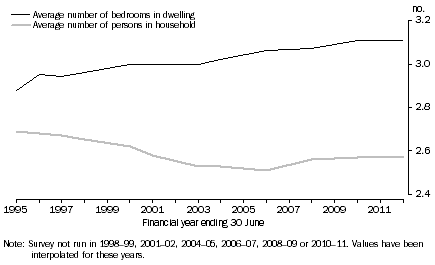
The report also stated that over 75% of Australian Households had more bedrooms than were needed for the number of occupants. So this would amount to about 6 million spare beds in the nation!
So if times got even tougher (which some of the statistics he quoted earlier seem to indicate they might) you may see children stay at home longer with their parents. Or some people may choose to take on a boarder, others may downsize to a house with fewer bedrooms.
Therefore there is plenty of room (pun intended) for Australia to use its housing stock more efficiently. Interestingly the statistics show this may be starting to happen, as the average number of people per household has fallen for 100 years but has just been edging up in recent years according to latest census data.
Another factor that could influence housing is that the average baby boomer couple has enough savings to last just 7 years. But they own a lot of houses that they may choose to cash up.
So as the dependency ratio falls (i.e. less people are working) so do house prices as per US, Japan, Ireland, UK and Spain.
Why He Still Prefers Gold
Perhaps not too surprisingly (given he works for a bullion dealer) Jordan still prefers gold to housing for a number of reasons:
Housing should be considered a lifestyle asset [or maybe not an asset at all if you live in it but rather an expense?]
Leverage Factor – Gold doesn’t [or shouldn’t] have to be bought on leverage. Whereas with housing it’s a necessity. And in another area that sound similar to here 30% of Australian mortgages being written today have loan to value ratios of over 80%. So if prices dropped 20% and these buyers had to sell they would have less than nothing left. Whereas while gold can fall in price, it will not go to zero or possibly even negative like leveraged property could.
Liquidity advantages – bullion can be sold easily and quickly any day, as opposed to the potential months it can take to complete a housing transaction.
Diversification advantages – This is also a function of gold’s divisibility. Gold can be bought in increments of any size/amount, allowing diversification in line with a specific ratio to other assets. Unlike a house where it will cost at least $500,000 and you can’t buy one bedroom at a time.
Minimal Transaction costs and operational costs – Gold costs next to nothing to store compared to the yearly maintenance and rates costs for housing. Transaction costs are also fairly minimal as long as you shop around.
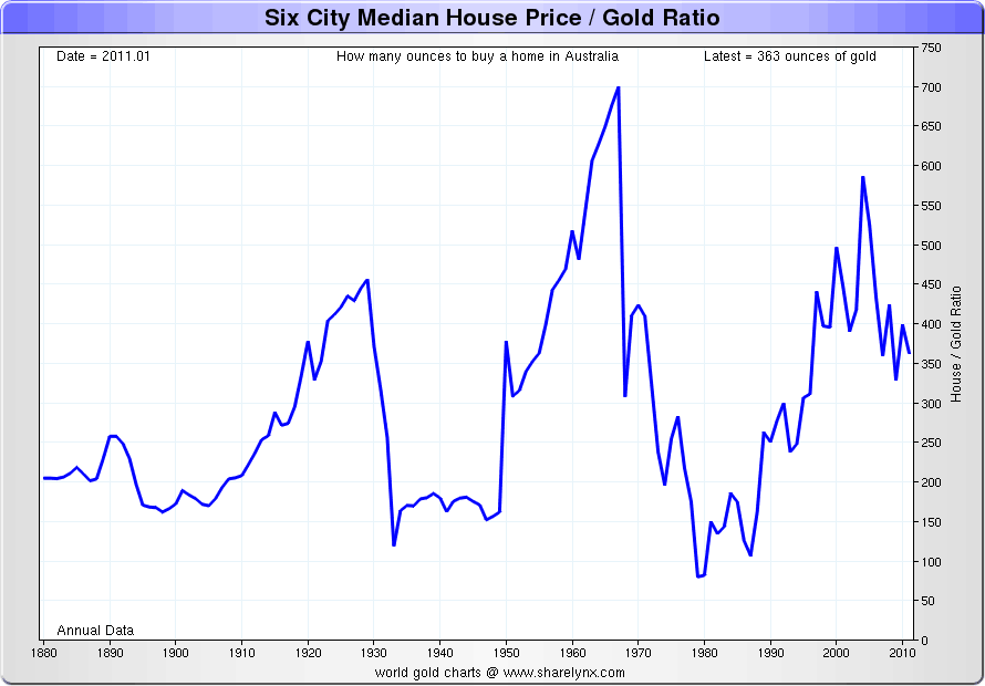
Relative Valuations Suggest Gold is Cheap Compared to Housing
Nick Lairds (of Sharelynx) Australian Six City Median House Price to Gold Ratio shows 100oz of gold should buy the median house at gold’s peak. Today at around 350oz we are some way off that mark still.
So for Jordan, gold is where he will remain focused for the time being.
We’re doing some research into a few numbers for New Zealand. Plus we’ll be updating our NZ gold to housing ratio charts too. So sign up for our email updates if you haven’t already to be kept informed of that. In the meantime…
How do you think New Zealand compares to Australia in some of the measures Jordan discussed? What impact will some of the above trends have here? Let us know you’re alive and leave a comment below!
Related: Rickards: The Lucky Country is Out of Luck – How About New Zealand?
Pingback: Watch Chindia | Gold Prices | Gold Investing Guide
Pingback: Jeff Berwick: The End Of The Monetary System As We Know It | Gold Prices | Gold Investing Guide