
Most analysis we’ve read lately leans towards the kiwi dollar continuing to rise and reach parity with the USD dollar. But as we’ve mentioned a few times lately we’re not sure this is such a one way bet.
Coincidentally last week in Chris Weber’s most recent report he touched on the performance of the Asia-Pacific economies, including their sharemarkets and currencies. (Weber is our favourite investment Newsletter writer, having an uncanny knack of getting the macro calls right over the years. Correctly picking many turning points like the end of the 1970’s bull market in gold, getting into gold and silver in the early 2000’s, getting out of stocks in 2007 etc. Definitely worth the yearly subscription price https://www.weberglobal.net).
Weber commented that the NZ dollar has been the best performing currency of the past 5 years and even with a low yield would have been the best currency to hold for any foreigner.
He then drew some conclusions which we found interesting and worth expanding upon.
So we can’t take too much credit here for original thought, but the charts he posted and conclusions he reached for all of Asia Pacific did fit in well with what we have been mulling over in recent weeks in relation to the NZD dollar possibly topping out.
Jan 22: NZ “Rock Star” Economy Already Priced into NZD?
Feb 20: Kiwi Dollar 20% Overvalued?
Mar 6: NZ dollar looking toppy?
Mar 13: So how did the dollar react to the RBNZ statement?
So we’ll begin by just throwing up various currency charts with a few comments.
The Chinese Yuan/Renminbi has risen steadily over the past 5 years, although notice that pretty sharp drop in the past month.
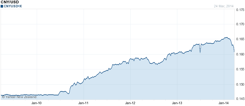
We commented in our weekly update last week that the Chinese central bank had increased the the daily band that it would allow the Yuan to trade in from 1% to 2% so as Weber pointed out it is now basically unpegged from the USD. So we could be seeing the start of a new weakening trend for the Yuan. Their central planners are likely looking for a weaker currency to cushion them somewhat against a slowing economy. Just like most everywhere else.
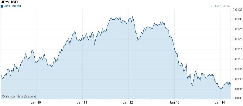
The Japanese Yen also strengthened until they began their massive money printing programme in 2012.
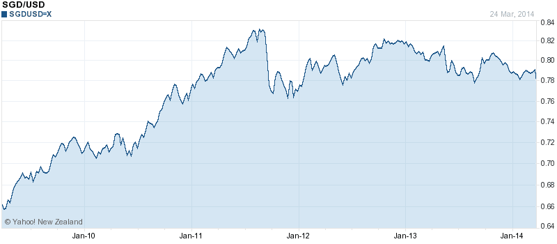
Turning to the Singapore dollar now. It has also been strong against the dollar, although it has not gotten back to it’s highs of 2011.
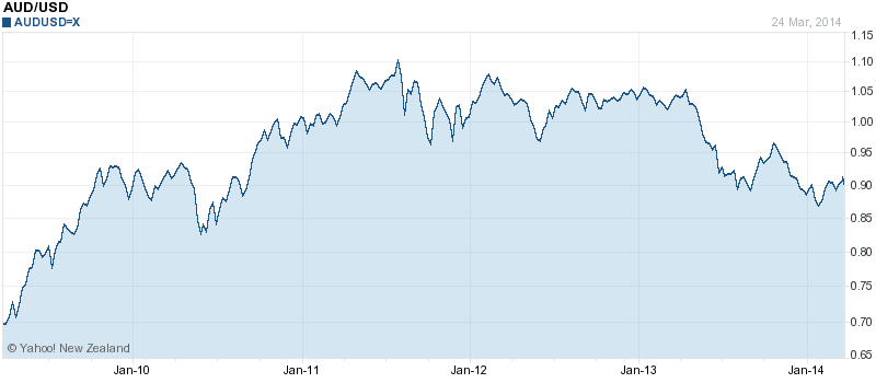
Our trans tasman neighbours are not dissimilar to Singapore. The Australian Dollar is up significantly from 5 years ago but it too is quite a way from it’s highs of 2011.
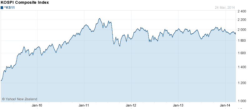
The Korea Won now. More of the same strength since 2009. Although It too has plateaued since 2011.
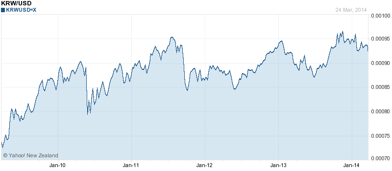
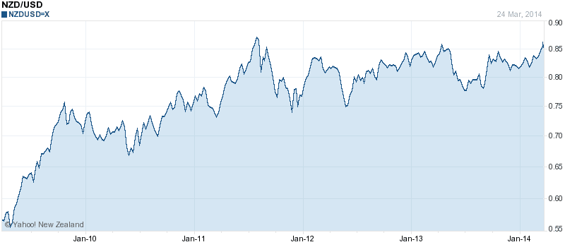
The New Zealand dollar chart is actually very similar to the Korean Won. Reaching a high in 2011, getting back close to it now although not yet above it.
Chris Weber makes the point that currency strength is usually an indicator of economic strength, which would seem to be backed up by most of these charts, with most Pacific rim nations performing better than the likes of Europe since the financial crisis.
However given the plateauing of all of these Asia-Pacific currencies, is this perhaps a warning of stalling economic strength in the region?
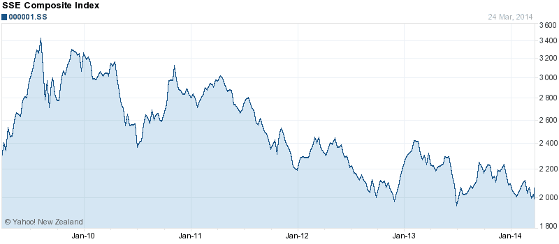
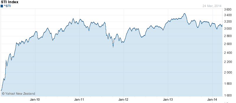
The stock markets of the likes of China (SSE Composite Index), Singapore (STI Index) and Korea (KOSPI Composite Index) might well have been indicating this for some years, either falling or being pretty stagnant since 2011.
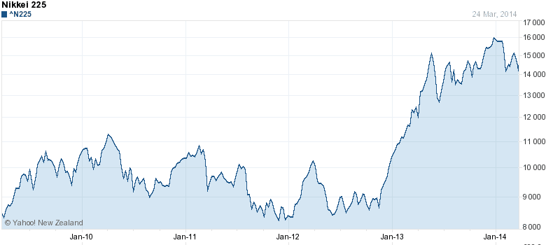
The Japanese Stock market was of course aided by the massive amount of currency they began creating in 2012, but it too has stagnated over the past year.
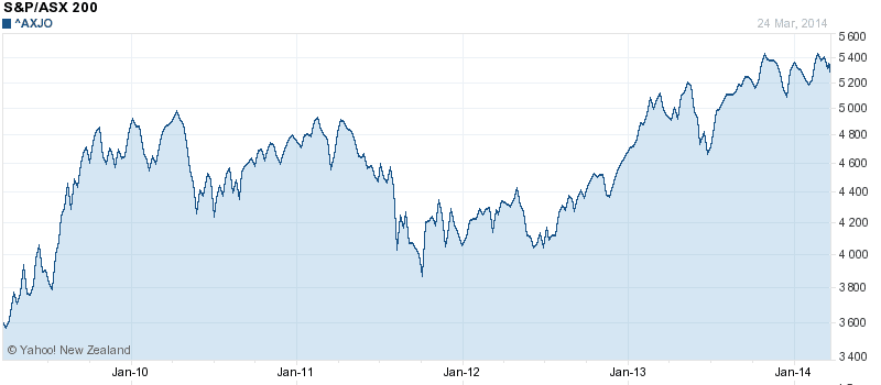
The likes of Australia and New Zealand share markets have performed pretty well since 2009. Here is Australia.
New Zealand in particular has done well over the past 2 years. Perhaps this is a reflection of our primary industry/food focus being least affected (or maybe the last affected) by an Asia-Pacific slow down?
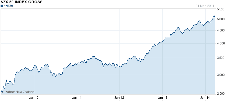
Overall Australia and New Zealand would appear to be the winners amongst these economies with rising currencies, stock markets and house prices.
But the question now is, does the stagnation of virtually all these Asia-Pacific currencies in recent years indicate a slowing of growth in this region?
If that was the case then New Zealand would no doubt be affected by this given China and Australia are our biggest trading partners.
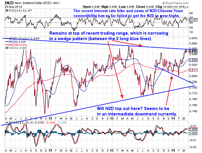
So again we wonder whether most of the good news about the New Zealand economy is already priced into the NZ dollar? When the RBNZ recently announced their interest rate hike and then the government announced the Kiwi/Yuan convertibility deal was done, the NZD/USD cross rate rose sharply. But it didn’t manage to move any higher and seems to have peaked out at around 86 cents.
This can be seen in the chart below which we’ve featured in recent weeks. (Note: Stockcharts always seem to have a slightly lower cross rate than elsewhere, hence the NZD appears to have topped out around 85 cents not 86 in this particular chart, but the overall trend is still the same.)
Of course, none of this means a crash is coming tomorrow, but maybe we are closer to the top than the bottom currently than most would think.
And as we’ve said before, it could be that New Zealand is one of the the last dominoes to fall, as food demand may be last to be affected by any slow down.
The other thought most won’t have considered is that credit trouble in China (which there are some signs of currently), could see a very fast stop to the capital that is currently flowing here and into the property market.
You won’t be surprised to hear us say it, but gold and silver are a hedge against a falling currency as well as a counterbalance to holding property.
Just the things that most in NZ would find hard to believe could happen currently. Rather the dominant opinion seems to be to expect NZ to keep powering ahead from here. But the time to buy insurance is not when you need it but when you think you don’t. That certainly applies to precious metals currently, with poor sentiment for them the order of the day. And low prices to match. Check out our order page if you’d like a quote: Gold and Silver Order Page.
Read more: The Number One Reason to Buy Gold in New Zealand Today
What do you think? Are we looking at a slow down ahead? Leave a comment below and let us know you’re alive.
Pingback: Silver continues to under-perform gold | Gold Prices | Gold Investing Guide
Pingback: Gold Merchants/ Users expect higher gold prices in 2014? | Gold Prices | Gold Investing Guide
Pingback: Gold Prices | Gold Investing Guide RBNZ Lifts Interest Rates - NZD Falls - Gold Prices | Gold Investing Guide