
This Week:
Weekly Price Overview – 11 March 2026
Precious metals moved higher this week as markets digest the recent rally. Gold rose modestly while silver rebounded more strongly, reflecting its greater volatility. Currency moves continue to influence local prices.
🟡 NZD gold rose $79.53 (+0.91%) to $8,793.24. After recently testing new highs near $9,000, price has pulled back and is consolidating above the former breakout level near $8,500. The rising 50-day moving average near $8,200 continues to provide a solid support zone. Sideways consolidation after strong advances is common and can create opportunities to average in.
USD gold gained $88.10 (+1.72%) to $5,212.63. After approaching recent highs, price has eased back toward support near $5,100. Gold remains well within its broader uptrend channel. Further sideways movement would be normal as the market digests the earlier rally.
⚪ NZD silver climbed $8.91 (+6.32%) to $149.98. Following the sharp correction from the late-January spike near $200, silver continues moving up and down around the first major support zone near its rising 50-day moving average (currently around $144). This back-and-forth action may continue as the market digests the earlier surge. A further correction or sideways base may form before the next sustained move higher.
USD silver increased $5.94 (+7.17%) to $88.91. Despite recent volatility, silver is still trading close to where it finished last year. Pullbacks toward $70 would likely represent an attractive long-term accumulation zone, given silver’s tendency for sharp corrections during bull markets.
💱 NZD/USD rose 47 basis points (+0.80%) to 0.5928. The Kiwi strengthened slightly this week but remains below its primary downtrend line and just above the 200-day moving average. While short-term rebounds are possible, the broader trend remains downward, which continues to support local precious metals prices.
📈 Takeaway: Gold remains steady within its broader uptrend while pausing below recent highs. Silver continues to show larger swings as it consolidates after its earlier surge. At this stage, the moves appear to be a normal pause within an ongoing precious metals bull market rather than a change in the longer-term trend.
War, Oil, and the Real Risk to the Global Economy
Markets Were Calm — At First
Over the past week the Middle East conflict has taken a serious turn. The United States and Israel have struck Iran. What had been simmering tension now looks like it could grow much larger.
Markets, however, were initially quite calm.
At first glance that may seem strange. If the world is becoming more unstable, surely gold should be soaring and markets should be panicking.
But crises rarely unfold that way. Gold does not always react to the first stage of instability. It often reacts later. The real drivers tend to appear afterwards — inflation, rising debt, and falling confidence in monetary policy.
We explored this dynamic in our article “How Does War Affect the Gold and Silver Price?”, which examines how precious metals have historically responded to major conflicts and geopolitical shocks.
Long-time US precious metals dealer Dana Samuelson made a similar point this week. He noted that markets “barely flinched” when the strikes first happened. But he also warned that the calm may not last. As the conflict continues, attention may shift to energy supply, oil prices, and inflation.
That is where things could change quickly.
If the conflict disrupts Iranian oil production or shipping routes, the effects could spread through the global energy system. Each day the conflict continues raises the risk of supply problems and higher oil prices.
Higher oil means higher costs across the economy.
Some commentators are urging caution about drawing too many parallels with the 1970s oil crisis. Writing in the New Zealand Herald, investment strategist Greg Smith argued that while the shock to oil markets is real, today’s global economy is more diversified and energy efficient than it was fifty years ago. That may limit the scale of the disruption.
That may prove true. But even a smaller energy shock can ripple through the global economy, especially when inflation and government debt are already high.
This may soon become less a military story and more an energy story.
And that is when the economic effects begin.
War Is a Supply Shock
Wars are extremely expensive. They damage supply chains and disrupt production. They also require huge government spending. Karl Krueger recently highlighted how quickly the financial cost of war can grow – often adding to already massive government debt.
That leads to a bigger point.
As John Butler explains in his latest Amphora Report, war is one of the most stagflationary forces in the economy. At its core it is a supply shock. Production falls. Costs rise. Governments respond with more borrowing and more money creation.
That mix — weak growth and rising prices — is called stagflation.
History shows these forces often last for years.
Energy prices rise. Inflation becomes harder to control. Governments run larger deficits. Central banks get trapped between supporting growth and fighting inflation.
That kind of environment tends to favour real assets.
Why Gold Responds Later
Dominic Frisby also made an important point this week. Conflicts like this often last longer than expected. What begins as a limited confrontation can turn into a long geopolitical struggle with economic effects far beyond the battlefield.
That is why it helps to step back from the daily moves in gold.
Gold does not always surge on the first headlines of a crisis. But it often responds to what comes next — inflation, rising debt, and falling confidence in currencies and policymakers.
In other words, the short-term moves in the gold price may tell us very little. The bigger story is the economic environment that follows.
If this conflict continues to escalate, those forces will become more important.
And that is why investors hold gold.
Charts of the Week: Still Early in the Precious Metals Cycle
Two charts this week highlight why the current move in precious metals may still be in its early stages.
The first comes from Tavi Costa at Azuria Capital. It shows how small US gold reserves are relative to government debt. In the 1930s and early 1940s, US gold reserves backed more than 50% of government debt. Today that figure is closer to 3%.
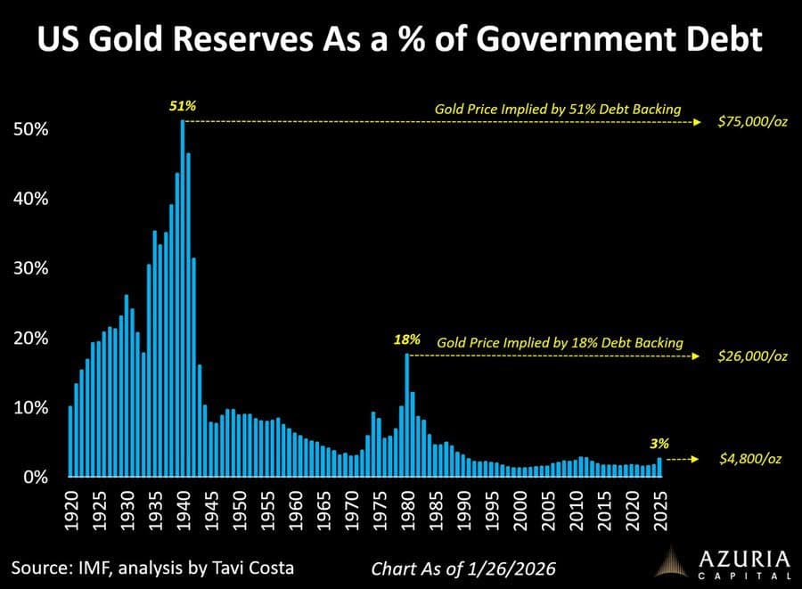
Costa argues that policymakers are increasingly boxed in. With government debt so high, interest rates cannot stay elevated indefinitely without making it unaffordable. At some point, central banks may be forced to ease policy again – even if inflation remains stubborn.
If that happens, the environment could become extremely supportive for precious metals.
A second chart, highlighted by Jesse Colombo using data from Topdown Charts, looks at how much of the ETF market is allocated to gold.
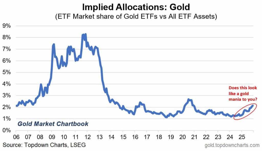
Even after gold’s strong performance in recent years, allocations remain low compared with past cycles. In other words, investor positioning still appears far from stretched.
That suggests the current move in gold may not be driven by widespread speculation or “mania” yet.
Instead, it may still be the early stages of a broader shift as investors slowly begin to reposition for a world of higher debt, persistent inflation, and growing geopolitical uncertainty.
A similar argument is also being made about silver
Precious metals analyst Ted Butler recently pointed out that from 1971 to 1980, silver rose roughly 420%. Since the 2024 breakout, the metal has risen about 140%. In his view, that suggests the current precious metals bull market may still be only partway through its cycle.
Butler also notes that the current gold-silver ratio, around 60:1, sits close to its long-term average and well above the extreme lows seen at the peak of the last great metals bull market in 1980.
In other words, while precious metals have already moved higher, history suggests the most dramatic phase of the cycle may still lie ahead.
In Conclusion
Whether the trigger is war, rising debt, or persistent inflation, the forces shaping the global economy are becoming increasingly clear.
Understanding those forces — and positioning accordingly — is why investors continue to turn to gold and silver. Please get in touch if you need any help.

Glenn's dedication to educating individuals on wealth protection through precious metals has helped over 2400 clients from New Zealand, Australia, USA and Europe to safeguard their financial futures. Passionate about financial independence and lifestyle freedom, Glenn’s mission is to empower others with the knowledge and tools to thrive in today’s volatile economic environment. When he's not advising on precious metals, Glenn enjoys spending time with his family and pursuing outdoor adventures.
Education: University of Auckland Bachelor of Science
Linkedin: https://www.linkedin.com/in/glenn-thomas-0984a4310/
- War, Oil and Gold: Market Implications of the Latest Middle East Conflict - March 11, 2026
- Is the Gold Bull Market Over? What the Charts Say - March 4, 2026
- Gold: Under-Owned, Under-Positioned — and Still Misunderstood? - February 18, 2026