
Table of contents
Estimated reading time: 7 minutes
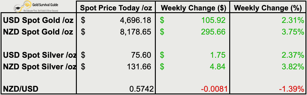
Weekly Price Overview – 1 April 2026
Precious metals rebounded this week as selling pressure eased. The move higher comes alongside continued NZD weakness, lifting local prices. Overall, price action suggests a stabilisation phase after the recent correction rather than a clear trend reversal.
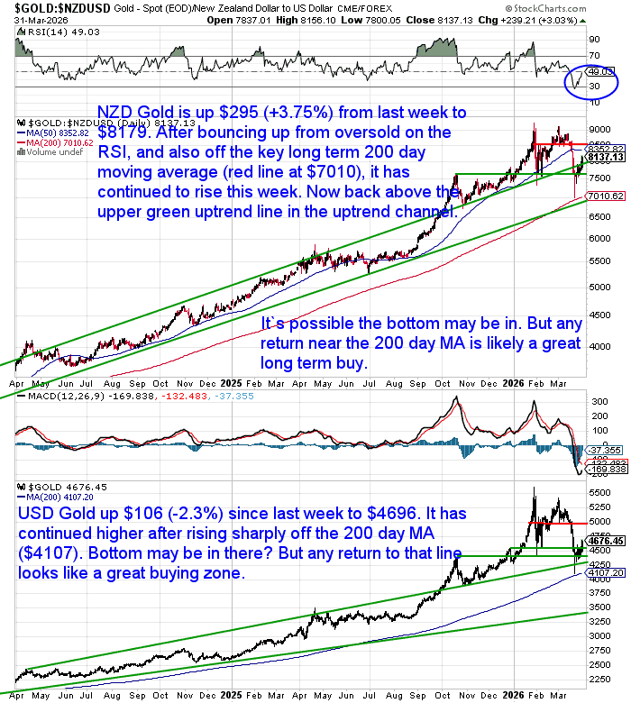
🟡 NZD gold rose $295.66 (+3.75%) to $8,178.65. Price rebounded from oversold levels and held above the rising 200-day moving average (near $7,010). It has pushed back toward the upper trendline of the long-term channel. The broader uptrend remains intact, though further consolidation would be normal. Any pullbacks toward the 200-day MA would likely offer constructive long-term entry points.
USD gold gained $105.92 (+2.31%) to $4,696.18. Price continues to recover after bouncing from the 200-day moving average (around $4,107). The trend remains higher, though momentum has slowed. A retest of the 200-day MA remains possible and would be consistent with a normal bull market pullback.
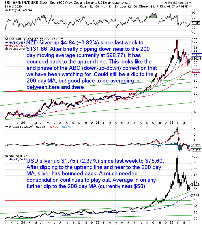
⚪ NZD silver rose $4.84 (+3.82%) to $131.66. After dipping near the 200-day moving average (around $98), silver has bounced back toward its uptrend line. The pattern still resembles a late-stage ABC correction. Volatility is likely to persist, with dips toward the 200-day MA offering averaging-in opportunities.
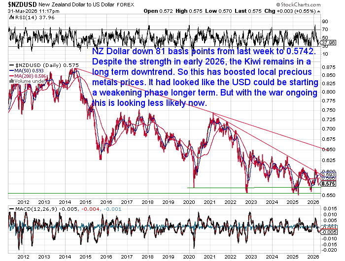
USD silver gained $1.75 (+2.37%) to $75.60. Consolidation continues following the earlier rally. Price remains above key support levels, with the $70 region holding. Further pullbacks toward the 200-day moving average (near $58) would be normal within the broader uptrend.💱 NZD/USD fell 81 basis points (-1.39%) to 0.5742. The Kiwi remains in a longer-term downtrend despite earlier strength in 2026. This ongoing weakness continues to support higher NZD gold and silver prices. A sustained move above 0.65 would likely be needed to shift the broader trend.
1970s Echoes: What History Suggests Comes Next
Peak… or Mid-Cycle?
Over the past week, several commentators have drawn comparisons between today’s market and the late 1970s – right before gold peaked in 1980.
One example comes from Bloomberg’s Mike McGlone, who suggests gold and silver may have already reached a “generational peak.” His view leans on the idea that today looks similar to 1980—the end of the last major bull market.
That may appear true on the surface. But the detail matters.
The current oil situation, for example, looks less like the 1979 Iranian Revolution – which marked the final surge – and more like the 1973 Yom Kippur War. That earlier event triggered the beginning of the inflation cycle, not the end of it.
That is a very important distinction in our view.
A recent piece by Brandon D. White makes this clear. The 1970s gold bull market did not end simply because prices got “too high.” It ended after a full cycle of monetary tightening, rising real interest rates, and finally, a shift in policy.
In other words, price alone wasn’t the cause. The underlying conditions changed.
That challenges the idea that today’s higher prices automatically signal a top.
We’re also seeing similar thinking from institutional investors.
DoubleLine Capital’s Jeffrey Gundlach recently described the pullback in precious metals as a revaluation phase, not the end of the trend. He views the recent drop – from around $5,500 to $4,400 – not as a warning sign, but as a potential entry point.
So while some are calling a peak based on historical comparison, others are using that same history to argue the opposite.
So what does the current data actually say?
Gold ETF Data Suggests a Bottoming Process
Moving from opinion to data, the picture becomes clearer.
Over the past few weeks, gold ETFs have seen steady outflows, even as prices remain relatively elevated.
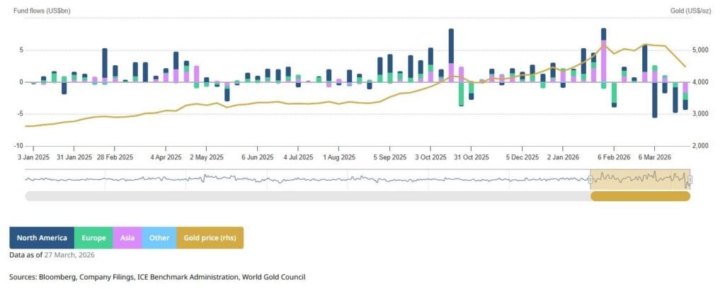
That’s not what you typically see at a major top.
Major tops tend to come with strong inflows and broad participation. What we’re seeing instead is investors selling into weakness.
That type of behaviour is more consistent with a bottoming process than a final peak.
Volatility Is Normal in a Bull Market
This also lines up with a broader point raised in a recent interview with James Henry Anderson.
Despite the recent drop—one of the sharpest since the early 1980s—this type of move is not unusual in a precious metals bull market.
- Silver is still roughly 2x higher than a year ago
- Pullbacks of 30–50% are common in past cycles
- These phases tend to be re-entry opportunities, not endings
The key idea is simple:
Volatility doesn’t end a bull market. It’s simply part of how it unfolds.
And this is where investor behaviour becomes just as important as the data…
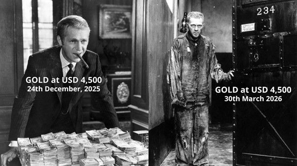
Meme of the Week: “Same Price… Different Sentiment”
This week’s meme, courtesy of Ronni Stoeferle, captures the shift in sentiment.
“Gold at USD 4,500 in Dec 2025:
Gold at USD 4,500 in Mar 2026:
Same price. Completely different sentiment.
That’s investor psychology in a nutshell: euphoria at the top, despair after a normal correction.”
Are We Entering a Third Wave of Inflation?
While sentiment has shifted in the short term, the bigger picture may be moving the other way.
Tavi Costa suggests we may be setting up for a third wave of inflation, – or even stagflation – similar to what happened in the late 1970s.
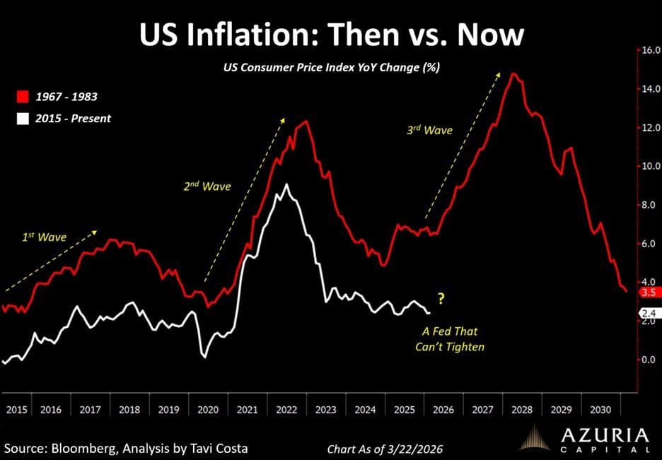
His argument is that markets are already starting to reflect this shift:
- Gold is decoupling from equities
- Hard assets are moving alongside energy and commodities
- The liquidation narrative has largely faded
But there is one key difference this time.
In the 1970s, central banks were eventually able to raise rates aggressively to bring inflation under control.
Today, that option may be far more limited.
If that’s the case, the cycle may not end the same way.
Which raises a more important question.
So How May it End?
Maybe with the following cycle playing out?
(Chart care of David William Scott via Mark O’Byrne).
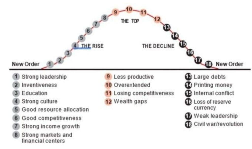
Scott believes:
“Gold is becoming a neutral reserve asset and the global reserve currency once again.
Right now, we’re between 16-17 as the USD & Treasuries head towards losing reserve status.”
This follows a familiar pattern:
- Rising debt levels
- Increased currency creation
- Growing internal pressures
- And eventually, pressure on reserve currency status
If that path continues, it helps explain why gold has held its place in every monetary system so far.
As always, the goal isn’t to predict every move… but to position yourself for the bigger trends.

Glenn's dedication to educating individuals on wealth protection through precious metals has helped over 2400 clients from New Zealand, Australia, USA and Europe to safeguard their financial futures. Passionate about financial independence and lifestyle freedom, Glenn’s mission is to empower others with the knowledge and tools to thrive in today’s volatile economic environment. When he's not advising on precious metals, Glenn enjoys spending time with his family and pursuing outdoor adventures.
Education: University of Auckland Bachelor of Science
Linkedin: https://www.linkedin.com/in/glenn-thomas-0984a4310/