The alternative media has featured a bit of talk about the US share market looking in danger and being very “toppy” in recent months. Today we’ll see how the NZ Sharemarket looks in comparison.
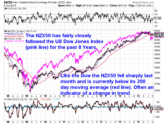
Below is a chart of the NZX50, an index of the top 50 companies in the NZ sharemarket. Also with the US Dow Jones Industrial average (INDU – pink line) plotted behind it.
You can see that the NZX50 has followed a fairly similar trajectory to the Dow in recent years. Definitely up – until recently anyway. Last month the NZX50 followed the US market lower although not by so much on a percentage basis. However it did break below it’s 200 day moving average (MA) (the red line) and remains below it today.
Does this matter?
Depends who you talk to really. It’s not always correct, but often when the price of something crosses below the 200 day MA, it is an indicator of a change in trend, from up to down.
So perhaps, like the US sharemarket, the NZX has topped out and is heading lower from here?
DOW:Gold Ratio
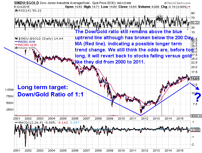
At the end of August we commented on the fall in the US sharemarket and shared a chart of the US Dow Jones Industrial average compared to the gold price. A.K.A the Dow:Gold Ratio. This is simply the Dow Jones Average divided by the US Dollar Price of Gold. Or put another way, how many ounces of gold it takes to buy the Down Jones Index. The lower the number the higher the gold price.
Below is an update of that chart. It too is now below its 200 day MA, indicating a possible change in trend. With the Dow falling and gold rising. We’d need to see it break below the blue uptrend line to say for sure this has happened. But our guess remains that before too long we may see this.
Read more: Dow Gold Ratio: How Does Gold Compare to Shares For the Past 100 Years?
NZX50 versus Gold in NZ Dollars
We can’t plot the NZX50 index as a ratio to the NZD price of gold so instead we’ve got a chart showing them both separately. Gold in NZ Dollars looks to have bottomed out at the start of 2015 and is in a steady trend higher. While perhaps the NZX50 is stalling and headed lower?
NZX50 versus Silver in NZ Dollars
How about the same chart with silver instead of gold? While its uptrend is not as strong as that of gold, silver in NZ Dollars also looks to have eeked out a bottom since the end of 2014. Again perhaps it is beginning to do just the opposite of the NZX50 and head higher from here?
Good Time to Sell NZ Shares and Buy Gold or Silver?
So to answer the question posed in the title of this article, is now a good time to sell NZ shares and buy gold or silver?
Well of course we make money selling gold and silver. So just like you shouldn’t ask a real estate agent if it’s a good time to buy a house, you shouldn’t take our word for anything on precious metals either!
But since you asked, the charts to us seem to show two groups of assets perhaps starting to move in opposite directions. Paper assets in the form of shares or stocks heading lower. While the hard tangible assets – gold and silver – look to be moving higher.
So a chance to sell high (shares) and buy low (precious metals) perhaps?
Read more: Gold and Silver Technical Analysis: The Ultimate Beginners Guide
To better understand what technical analysis is, and help with timing when to buy gold or silver and check out this article: Gold and Silver Technical Analysis: The Ultimate Beginners Guide


