
Gold and silver technical analysis can be a very large and confusing subject. Technical analysis can seem far too difficult to the new gold and silver buyer. So many people just ignore the topic altogether.
But it needn’t be this complex. We’ve written this Gold and Silver Technical Analysis Ultimate Beginners Guide to simplify this topic down to the core basics. You can use the principles to help with timing your purchases of gold and silver in 2023 and 2024.
Once you’ve read this ultimate guide here’s what you’ll know:
Table of contents
- What is Technical Analysis?
- What are the Benefits of Technical Analysis in Gold and Silver?
- Is Gold and Silver Technical Analysis of Any Use if Markets are Manipulated?
- The Different Types of Charts Available For Gold and Silver Technical Analysis
- Where to Get Gold and Silver Technical Analysis Charts for Free?
- Our Favourite Gold and Silver Technical Analysis Indicators
- Gold and Silver Technical Analysis: What Should You Do Next?
What is Technical Analysis?
Technical analysis is simply using charts and indicators with a view to determining where the price of a financial asset (such as gold or silver) may be heading. But based solely upon what the price has done in the past.
This is completely different to fundamental analysis. Where instead we research reasons to buy (or sell) a financial asset based upon its intrinsic value. But using quantitative and qualitative data to do this.
In the case of gold and silver this could include quantitative data that attempts to value gold and silver or to value it against other financial assets. Such as those covered in these articles:
How Do You Value Gold | What Price Could it Reach?
How Does Gold Compare to Shares For the Past 100 Years?
Wages from Ancient Greece and NZ Housing Both Say Silver Undervalued by a Factor of 20
Or qualitative data such as the reasons to buy gold and silver covered in these articles:
Bank Failures | Could they happen in NZ | The Reserve Bank thinks so
What Good is a Bar of Gold When the Shelves are Empty?
What are the Benefits of Technical Analysis in Gold and Silver?
So what are the benefits of gold and silver technical analysis?
- You can likely save more money (or buy more gold or silver for the same amount of money) simply by buying at better times (i.e. when the price is lower). Compared to what you can likely save by spending hours shopping around to save a few dollars per ounce from one dealer to the next. Technical analysis done right can help you buy at these better times.
- Gold and silver technical analysis may help with deciding when to sell. On a long term basis at least anyway. Trading in and out of physical gold and silver regularly is not a great idea as the buy sell spreads (difference between price to buy and price you get when selling) is larger than say shares, options, or futures.
- May save you from “paralysis by analysis”. It’s not uncommon to get stuck never buying as it may always seem like there is a lower price ahead only to miss the price bottoming out and then see it move higher. Having some technical indicators to pre determine your buying levels can eliminate or at least reduce this “analysis paralysis”.
Is Gold and Silver Technical Analysis of Any Use if Markets are Manipulated?
There has been a good deal of evidence unearthed documenting manipulation of the gold and silver markets. So if a market is manipulated is it worth carrying out technical analysis?
We delve into this topic in detail in this article: Why bother with technical analysis if gold and silver are manipulated?
But in a nutshell we still say yes it is.
While enough people still follow them we reckon it is worth keeping an eye on technical indicators when looking at when to make a purchase of gold or silver. As while not all buyers and sellers may be “rational”, many are. So many are still looking at charts and taking note of support levels, MACD’s, RSI’s and moving averages in making decisions on buying and selling.
So if plenty of people are still following these indicators, the indicators still likely have some value.
On top of this, it seems to us that those doing the manipulating are perhaps only able to nudge the price in a certain direction. Whereas it still takes a good many other buyers or sellers to keep it going in that direction. So if these market participants are watching levels of support and resistance and other indicators, then you could again argue that it is also worth keeping an eye on them too. Particularly when it comes to trend changes.
So we’d say there is still a use for technical analysis in gold and silver markets, as long as (1) it’s not in isolation, and (2) that you remain aware of its shortcomings.
The Different Types of Charts Available For Gold and Silver Technical Analysis
There are 3 commonly used charts when conducting technical analysis of gold and silver.
They are daily, weekly and monthly charts. (There are also charts that plot the prices by hour or minute. However these are more relevant to day traders trying to buy and sell futures contracts on a very short term basis.)
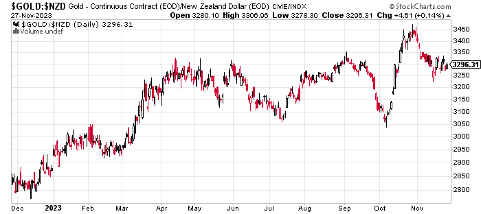
Daily Chart
A daily chart simply plots the closing price (i.e. the end of day price) every day. So in a chart covering a full year there will be 365 data points.
Weekly Chart
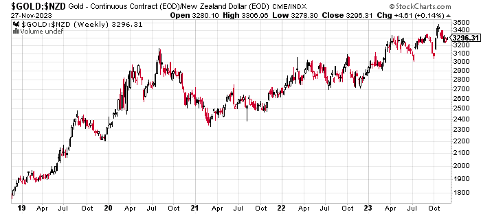
A weekly chart plots the closing price every Friday. So in a year there will be 52 data points. Or in a 5 year chart like the one below 260 data points.
Monthly Chart
While a monthly chart plots the closing price for the last day of every month.
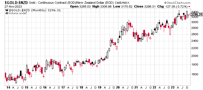
The weekly and monthly charts are useful for showing longer term changes in trend. As they remove the day to day “noise” in the price. The 10 year chart above shows the price has clearly been rising since 2014. It also highlights that gold priced in NZ dollars is building a base at higher prices above $3200 in recent months.
But generally we will uses daily charts more often when determining good buying zones.
Where to Get Gold and Silver Technical Analysis Charts for Free?
Our preferred site for getting technical analysis charts is stockcharts.com. They have a free option as well as a paid option if you’d like to save your favourite charts.
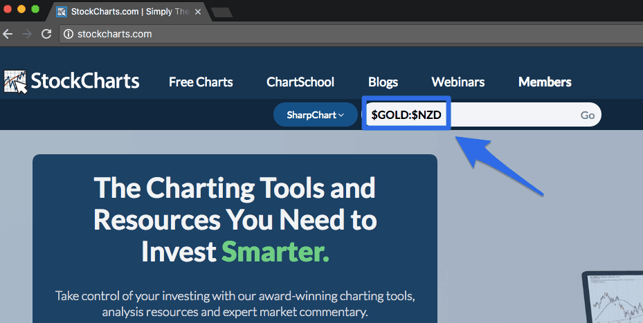
For gold and silver prices in New Zealand dollars just go to stockcharts.com and enter in $GOLD:$NZD or $SILVER:$NZD as shown below:
Why Do We Use the Gold and Silver Prices in New Zealand Dollars?
Because if you’re a New Zealand resident you will buy in New Zealand dollars. So it makes sense to track the gold and silver price in the currency you will buy in.
See this article for a more detailed explanation on that topic: Why You Should Ignore the USD Gold Price When Buying in New Zealand
Likewise if you live in a country other than New Zealand, you should track the gold and silver price in your home country. Just replace the “$NZD” with whatever your local currency is. While if you want USD prices just use $GOLD or $SILVER.
You can also view live charts of gold and silver prices on our Live Charts page.
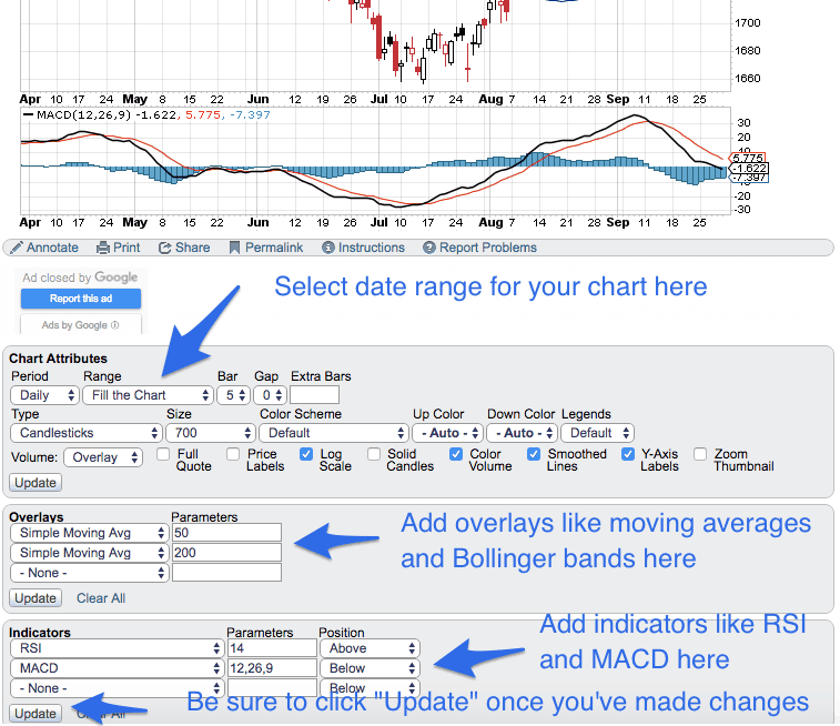
Once your chart is displayed on stockcharts you can:
- Select the date range you’d like displayed
- Add overlays such as moving averages or Bollinger bands (don’t worry we’ll get to these shortly)
- Add technical indicators like RSA and MACD (again coming up soon)
- Click the “Annotate” button to add trendlines and Fibonacci retracement lines (yep again stick with us and we’ll get to these!)
Our Favourite Gold and Silver Technical Analysis Indicators
The options for indicators to use in performing gold and silver technical analysis are just about unlimited. You could easily get lost in a quagmire of analysis!
But here are a few of our favourites. They are also probably those that are the easiest to understand.
( 1.) Trend Lines
A trendline is perhaps one of the simplest and most commonly used technical analysis indicators.
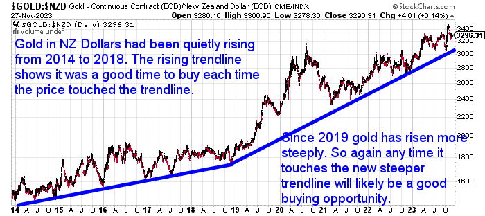
It simply connects points on a chart to indicate a rising or falling price trend. Often the price will bounce off a trendline, thereby making this a good time to buy (for a rising trendline) or to sell (for a declining trendline).
The trend line in the chart below shows the NZD gold price has been in a rising trend from 2014 to 2018. Then since 2019 gold has risen more steeply. But each time the price has fallen to touch the trend line, this has proven to be a good time to buy. Just as it did recently in October 2023.
( 2.) Horizontal Lines of Support and Resistance
Horizontal support and resistance lines function in much the same way as a trendline does. First let’s define support and resistance:
Support:
Means the price finds the “support of buyers” at this level and therefore has bounced higher. This price now becomes a “line of support” where we might expect the price to bounce higher if it were to reach it again.
Resistance:
Is just the opposite. Buyers were not prepared to buy at this level and so the price fell. It might now act as a “resistance level” and will take an increase in buyers to break through this level.
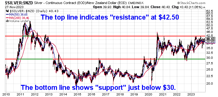
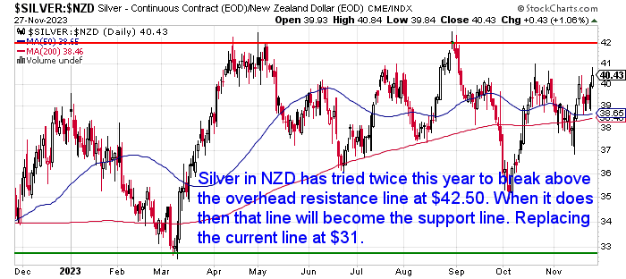
Here’s a real life example of Support/Resistance lines as of 28 November 2023:
Silver priced in NZ Dollars has tried twice this year to break above the overhead resistance line at $42.50. When it finally conclusively breaks through, then that line at $42.50 will become the new support line. So any pullback to come after that would likely see what was overhead resistance now become the horizontal support line. So once a clear break out has taken place, we might expect the price to bounce higher after any pullback to this $42.50 area.
( 3) 200 Day and 50 Day Moving Averages
A moving average line is another indicator that helps show trends in play. They can also show areas where the price might find support or resistance (as explained above). Moving averages smooth out the short term noise by plotting the average price over a period of time.
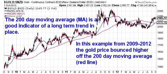
We prefer to use the 50 day and 200 day moving averages in our charts. See the blue and red lines below.
There are 2 common ways the 50 and 200 day moving averages (MA) can be used.
- The 200 day moving average is a useful indicator of a long term trend in place. So when the price is above the 200 day MA line we can say gold or silver is in a rising or bull market. The price will therefore often find “support” (as explained earlier) and bounce higher off the 200 day MA.
- When the 50 day MA crosses above the 200 day MA, known as the golden cross (as it did in late 2009 in the chart below), this is often an indicator of a change in trend to a rising price. Conversely when the 50 day MA crosses below the 200 day MA (as it did in March 2012 below), then this is often indicative of a change in trend to a falling price.
( 4.) Bollinger Bands
Bollinger bands have nothing to do with champagne! We guess unless they help you buy at a good time and you want to celebrate with some bubbly!
They were created by a guy by the name of John Bollinger. We won’t get into the technicalities of how they are calculated and what they mean, other than to say they are a measure of volatility. See here for more details if you’d like.
We like to use the Bollinger bands in combination with the Relative Strength Index (see below for more detail on that), to help identify when gold and silver are overbought or oversold.
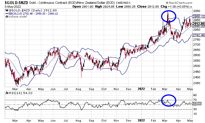
In the chart above, the NZD gold price went above the top of the Bollinger bands. While also getting overbought on the RSI. This was a solid indicator back in March 2022 that a short term correction was near. Sure enough the price dropped sharply in the weeks following this.
( 5.) Relative Strength Index (RSI)
The Relative Strength Index is one of our favourite gold and silver technical analysis indicators to use.
It doesn’t require any in depth knowledge or understanding of what it does. All you need to know are 2 things:
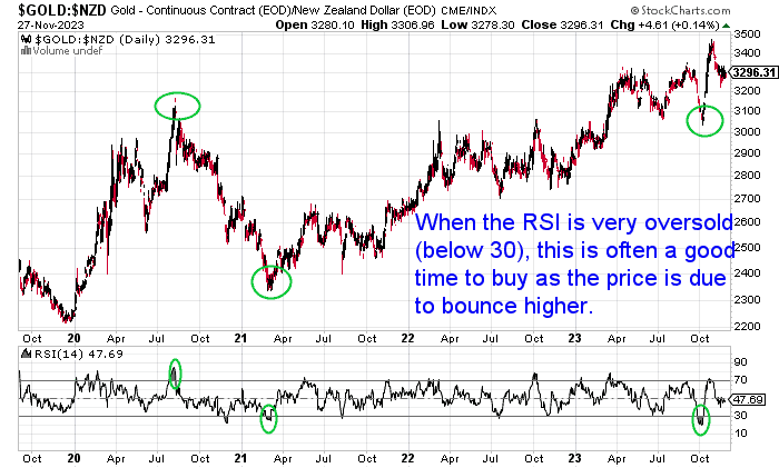
- When the indicator is above 70, the price of gold or silver is getting very overbought. So it’s likely not far off falling in price
- When the RSI indicator is below 30, the price of gold or silver is getting very oversold. Therefore it’s likely the price will bounce higher before too long.
The Relative Strength Indicator (RSI) is shown at the bottom of the below chart. You can clearly see the 2 times the RSI got extremely oversold below 30 was a good time to buy gold, as the price moved higher soon after. Recently in October 2023 silver was the most oversold it had been in years. So not surprisingly silver had a sharp run higher after this
( 6.) MACD (Moving Average Convergence Divergence)
The Moving Average Convergence Divergence (MACD) is often referred to as the Mac-D.
Again like many of these technical indicators there are many ways the MACD can be used to get buying and selling signals.
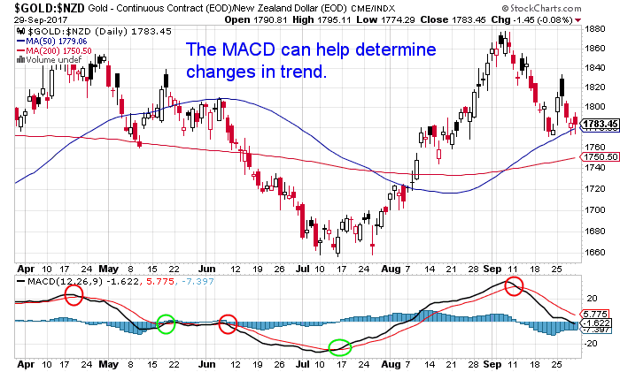
In the chart below when the MACD line (black line) fell below the signal line (red line) around Sept 11 (marked with a red circle) this was a bearish signal that prices may fall.
Conversely around July 17 the MACD line crossed above the signal line (marked with a green circle), this was a sign prices were due to head higher.
If you’d like a more detailed look at this indicator then please check out this article of ours: What is the MACD indicator?
( 7.) Fibonacci Retracement Lines
Fibonacci retracements are based upon the key numbers identified by Leonardo Fibonacci in the 13th century.
These are: 0, 1, 1, 2, 3, 5, 8, 13, 21, 34, 55, 89, 144, etc. Each number is simply the sum of the two preceding numbers. Each number is also approximately 1.618 times greater than the preceding number. This common relationship between every number in the series is the foundation of the common ratios used in Fibonacci retracement.
…a Fibonacci retracement is created by taking two extreme points (usually a major peak and trough) on a stock chart and dividing the vertical distance by the key Fibonacci ratios of 23.6%, 38.2%, 50%, 61.8%, and 100%. Once these levels are identified, horizontal lines are drawn and used to identify possible support and resistance levels.
Source.
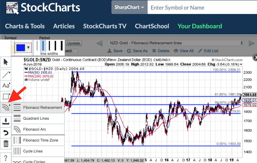
The Fibonacci Retracement tool in stockcharts.com can be found after you select to “Annotate” a chart. The tool is found here:
Here’s a real life example of Fibonacci Retracement lines as of 28 November 2023:
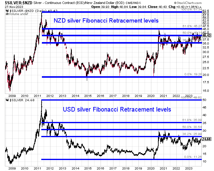
Below is a chart of Silver priced in NZ dollars (top) with the Fibonacci retracement lines added. These are from the high in 2011, to the low repeatable hit at $20 from 2015 to 2020. The bottom half of the chart is silver in US dollars.
We can see how the price is currently right on the 50% retracement level. It has managed to edge above this a couple of times this year. However the 61.8% retracement level has proved to be tough resistance back in 2020 and has not been reached yet. While the 38.2% level has provided strong support through recent months.
To learn more about when to buy gold or silver check out this article: When to Buy Gold or Silver: The Ultimate Guide
Gold and Silver Technical Analysis: What Should You Do Next?
Technical analysis is a huge subject. But we think it’s worth spending a little time to at least familiarise yourself with the basic indicators we’ve outlined above. As doing so will likely help you buy gold and silver at better price points.
Also go and sign up for our daily price alerts.
We include some basic technical analysis in these every week day. So most of the work is already done for you there.
But now having read this post on basic gold and silver technical analysis, you should find it a lot easier to follow what we’re saying in our daily and weekly emails.
This will help you get a better entry point when buying gold and silver. If you’re looking to sell gold or silver it will also help you better time your exit.
So that will give you the basics.
But if you’re after some training you can watch and listen, then sign up for our upcoming free Q&A Call where we’ll cover: How to Improve Your Timing When Purchasing Gold and Silver. There will be a recording so sign up to receive that even if you can’t attend live.
Editors Note: This article was first published 3 October 2017. Last updated 28 November 2023 to include most recent charts and prices, along with a real life current example of various indicators.

Glenn's dedication to educating individuals on wealth protection through precious metals has helped over 2400 clients from New Zealand, Australia, USA and Europe to safeguard their financial futures. Passionate about financial independence and lifestyle freedom, Glenn’s mission is to empower others with the knowledge and tools to thrive in today’s volatile economic environment. When he's not advising on precious metals, Glenn enjoys spending time with his family and pursuing outdoor adventures.
Education: University of Auckland Bachelor of Science
Linkedin: https://www.linkedin.com/in/glenn-thomas-0984a4310/
- What Could A Global Currency Reset Mean For New Zealand? - June 19, 2026
- How Much Gold Does New Zealand Have? Why The Reserve Bank Holds Zero Gold Reserves - June 17, 2026
- Gold’s 2026 Correction: What Happens Next? - June 17, 2026
