See how money supply, government inflation statistics, property and gold prices all compare over the past 24 years…
Table of contents
- NZ Money Supply and House Prices
- NZ House Prices Over the Past 2 Decades – How’s This for Spooky?
- How Does Money Supply Compare to the NZ Government Inflation (CPI) Calculations?
- Now Let’s Look at Bank Interest Rate Returns
- How Do Property and Bank Deposits Compare to Gold in NZ Dollars?
- So What Can We Learn From All These Inflation, Housing, Bank Deposit and Gold Numbers?
- 1. Don’t trust government inflation and CPI figures – even the recent historically high rates are likely under-reporting inflation.
- 2. Don’t leave your money in the bank long term.
- 3. Real assets such as property, gold and silver are the way to go during the slow but steady death of money, rather than bank deposits.
- 4. Interestingly the above numbers show gold actually has outperformed property over the past 24 years in New Zealand.
Estimated reading time: 9 minutes
NZ Money Supply and House Prices
“House prices double every ten years”, the old adage goes.
So why is this?
Well, we reckon the following chart pretty much answers the question.
New Zealand Money Supply M3
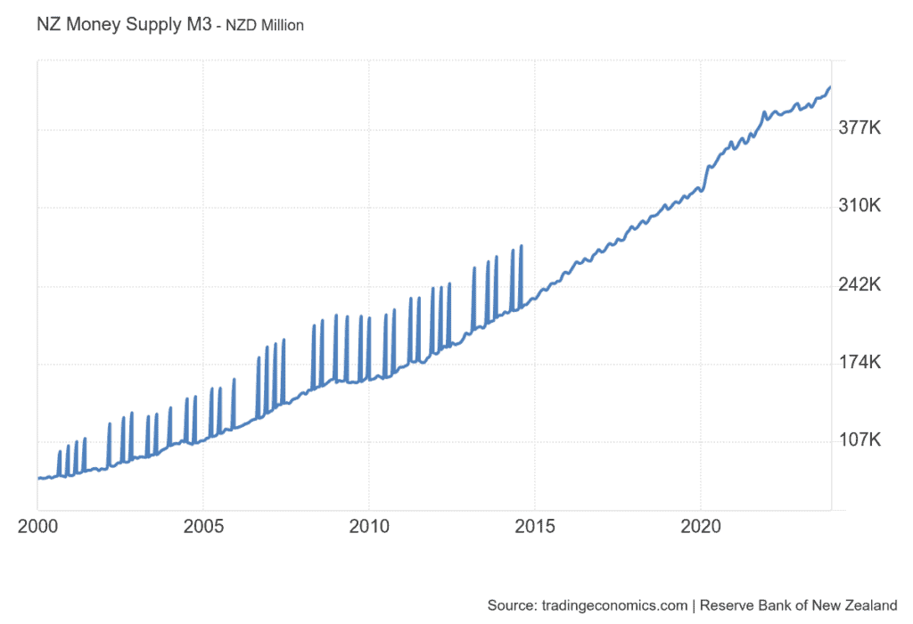
The chart is taken from a very interesting website called tradingeconomics.com. They have all sorts of data from just about any country on the planet. Inflation, GDP, Debt. You name it, they have it.
Anyway, this chart is constructed using Reserve Bank of New Zealand (RBNZ) data and shows New Zealand’s money supply over the past 24 years. Take a closer look at the start and end points.
You’ll see the money supply doubled from $75 Billion as of January 2000 to $163 Billion in December 2009. Then over the next 10 years the money supply roughly doubled again to $326 billion in December 2019. Things cranked up in 2020 with the central bank response to covid19 and money supply has surged in the next 2 years, then has slowed up a little since then to reach $411 Billion in November 2023.
So overall since 2000 New Zealand money supply has increased 5.5 times.
Now depending on which branch of Austrian Economics you follow (if any!), it will affect how you view the “quantity theory of money”.
It may be an oversimplification saying that the amount of currency in circulation has a direct and proportional relationship to the prices of goods and services. But nonetheless, more digital currency units chasing about the same amount of goods, is going to mean paying higher fiat dollar prices for said goods. (See this video interview with Professor Fekete for his take on the quantity theory of money).
And this may be an oversimplification too. But isn’t it a handy “co-incidence” that the money supply has roughly doubled over each of the last 2 decades? While this is the same period often cited over which house prices will double?
Also interesting was that from 2020 to 2022, money supply shot up higher. Hmmm. What did house prices also do over that time? Do record price rises ring any bells?
Could it be that rising house prices are actually just a reflection of an increasing pool of money chasing the relatively fixed housing stock?
[Here’s what we said back in 2020. Seems house prices and now inflation have played out just as we suspected they might… ]
Sidenote: NZ Money Supplies Spikes Due to RBNZ Response to COVID-19
It’s also worth pointing out how sharply the M3 money supply has jumped as a result of the RBNZ quantitative easing in response to the COVID-19 crisis. After rising at a fairly steady rate since 2015, M3 is now just under $350 billion in April 2020. Up from around $325 billion at the start of 2020.
Perhaps we will see this sharp increase in money supply reflected in house prices and CPI in future months/years?
NZ House Prices Over the Past 2 Decades – How’s This for Spooky?
Here’s a chart of New Zealand residential property prices since the year 2000.
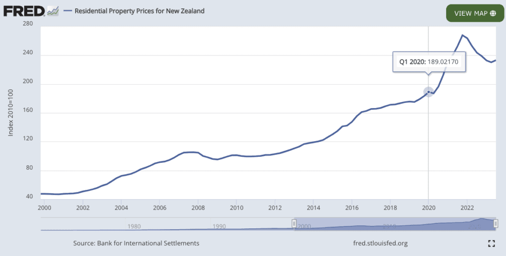
We can see that house prices have pretty much exactly doubled and then doubled again since 2000. With the house price index starting from around 47.5 in the first quarter of 2000, rising up to 189.02 in Q1 2000. (A perfect double and then double again would have come to 190).
So that is pretty much spot on with the old adage of house prices doubling every 10 years. It also nicely ties in with the growth in the New Zealand money supply.
COVID19 Response: Sharp Increase in Money Supply Coincided with Sharp Increase in House Prices
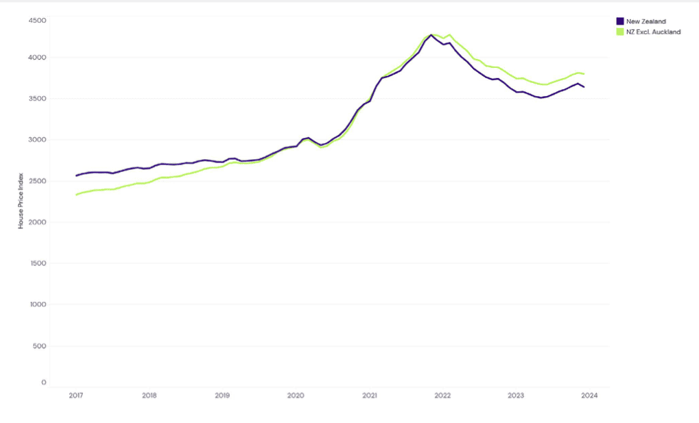
As noted already, the sharp increase in money supply in 2020 also manifested significantly higher house prices over that time period. Here’s a chart from the latest REINZ Monthly House Price Index (HPI) Report from December 2023. The charts in this report only go back to 2016. But we can see the impact of the central bank response in the significant increase in the index since 2020 (marked in red). Referring back up to the house price index via FRED, in total the index is up 4.91 times since the year 2000 or up 391%.
This compares closely to the money supply increase of 5.5 times since 2000.
We can also now see the impact of the recent interest rate increases as house prices have fallen.
How Does Money Supply Compare to the NZ Government Inflation (CPI) Calculations?
Let’s crank up the trusty RBNZ inflation calculator. (Perhaps trusty is not the best term to use in the same phrase as a central bank. Although we guess they can be trusted to reduce your purchasing power in the long run!).
So we plug in $75,000 at the end of 1999 – to correspond to the $75 billion starting value in the money supply chart.
24 years later, a basket of goods and services would “only” have cost $138,319.63. So a percentage change of 84.4% inflation.
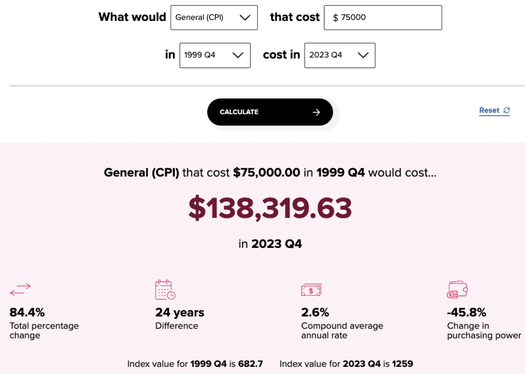
This is significantly less than the doubling and doubling again of the M3 money supply. It’s also significantly less than the 4.91 times increase (391%) in the house price index over the same period.
So the government CPI is much less than the increase in house prices.
Source: RBNZ
Now Let’s Look at Bank Interest Rate Returns
Again we turn to the data of Tradingeconomics.com, showing bank deposit rates since 2000. It’s clear how these dropped during the financial crisis from above 8% to under 3%. Then during COVID19 deposit rates moved closer to zero, until their sharp rise in the last few years.
source: tradingeconomics.com
We don’t have access to the raw data to calculate the average deposit rate since 2000. But from the chart it looks like it might be around 4%. For the 2010 to 2020 decade it would be under 3%.
But a reasonable assumption would be to say bank deposit rates have averaged around 4% since 2000.
We’ll ignore the fact that withholding tax is payable on the interest to keep it simple too. Using the RBNZ CPI numbers above for inflation (84.4% since 2000), we get an average 3.52% inflation rate per year over the last 24 years.
Therefore over the 24 year period you’ll get a return of less than 1% a year. Even if we called it 1% a year after inflation, so a total of 24% in the last 24 years. And remember this is also before tax!
Withholding tax would reduce the 4% down to around 3%. So your return would then be negtive! And that’s based upon the official government statistics. Which you’ll see below, most likely understate the true inflation rate of staple everyday goods and services.
How Do Property and Bank Deposits Compare to Gold in NZ Dollars?
As noted in our 2023 year in review, gold at 1 January 2000 was priced at NZ$551. At the end of December last year it was NZ$3278.68. (And with the recent rise, gold is over $200 per ounce more than this as we type at NZ$3536. But today we’ll stick to comparing the same periods as money supply, housing, and bank deposit returns).
So gold in NZ dollars has “risen” by 495% or gained nearly 6 times its value when measured in dollars since January 2000.
Of course as always, we remind you that the correct way to frame this, is that paper money is losing value, rather than gold “going up”.
So What Can We Learn From All These Inflation, Housing, Bank Deposit and Gold Numbers?
1. Don’t trust government inflation and CPI figures – even the recent historically high rates are likely under-reporting inflation.
We have mentioned this many times in the past. The various statistical adjustments and substituting of one good for another when it gets too expensive, seriously underscores the rising cost of everyday goods.
As does the fact that the likes of flat screen TV’s and computers, which are constantly falling in price, are also included in CPI inflation calculations. But we don’t buy these types of goods everyday!
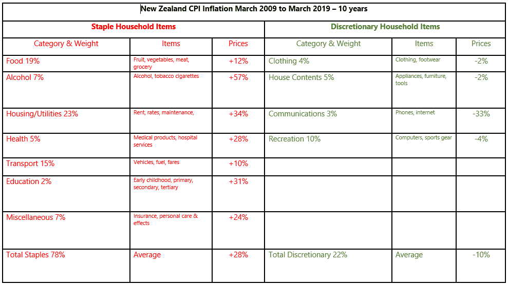
The table below clearly shows the difference in consumer price inflation between “staple” items and “discretionary” items.
Staple items are up 28% over 10 years, whereas discretionary items have fallen 10%.
As Roger Kerr points out:
Lower socio-economic groups in our community who do not have the discretionary spending cash to buy the latest whizz-bang electronic stuff are not experiencing any benefits of the so-called low inflation. Their household staple expenses have been increasing at 2.8% per annum on average.
The dangers of continually slashing interest rates in response to the very low inflation is that speculative asset bubbles are created in property and equity markets as it is very cheap to borrow.
Under this scenario the gap between rich and poor will continue to widen.
Other losers are elderly investors who are now receiving less than 3.00% return in bank deposits and are being forced into dividend stocks (with attached equity market risks) to earn enough money to live on.
Running a super-loose monetary policy, due to the low inflation the technology revolution has created, is producing a few risks and adverse consequences that do not seem to be well understood.
Source.
Since Kerr wrote the above in 2019, the risks identified have indeed played out. There have been bubbles in sharp rises in property and equities (shares) which saw the gap widen between rich and poor. Now we are seeing the air deflate out from these bubbles.
2. Don’t leave your money in the bank long term.
The bank deposit numbers above show you’ll be getting a return of close to zero. And after you take the real inflation rate off this (i.e. a CPI without all the discretionary items), you’ll be getting a negative real return.
So money in the bank long term is losing purchasing power.
3. Real assets such as property, gold and silver are the way to go during the slow but steady death of money, rather than bank deposits.
The returns of gold and property show that hard assets are the way to go to preserve and even grow your purchasing power in the long run.
4. Interestingly the above numbers show gold actually has outperformed property over the past 24 years in New Zealand.
Property went up almost 391% compared to gold rising 495%.
But property gets all the headlines and gold is ignored.
As noted already gold is also up even further this year. While real estate prices are down since the end of 2021. Perhaps real estate prices are turning back up again now too?
However, right now buying gold looks to have more upside than property in New Zealand.
Editors Note: This article was first published 12 March 2013. Originally just including numbers for the previous decade. Updated 2 June 2020 to include data from 2000 to 2020 and further explanation of what we can learn from the data. Last updated 11 March 2024.
What do you think? Is it just a coincidence that the NZ house prices have risen roughly in proportion to money supply growth over the past 24 years? Show us you’re alive and leave a comment below!…
Pingback: Gold and Inflation Analysis 2023 | Gold Survival Guide
Pingback: The NZD Gold Price vs Inflation: Analysing the Performance and Break-Even Potential - Gold Survival Guide
I had $500,000 in the bank and received .05% interest or $250.00 for half a million for 12 months before tax. Yes gold is a far better investment!